Yoky Toky Sushi
Our Purpose
The goal is to create a sushi brand that feels refined without tipping into tradition for its own sake. Yoky Toky combines Japanese inspiration with a contemporary, approachable character. The identity communicates care and precision, giving customers a sense of experience rather than just a menu. It works naturally across the physical restaurant and digital platforms alike. The result: a brand that feels distinctive, understated, and memorable.
Approach
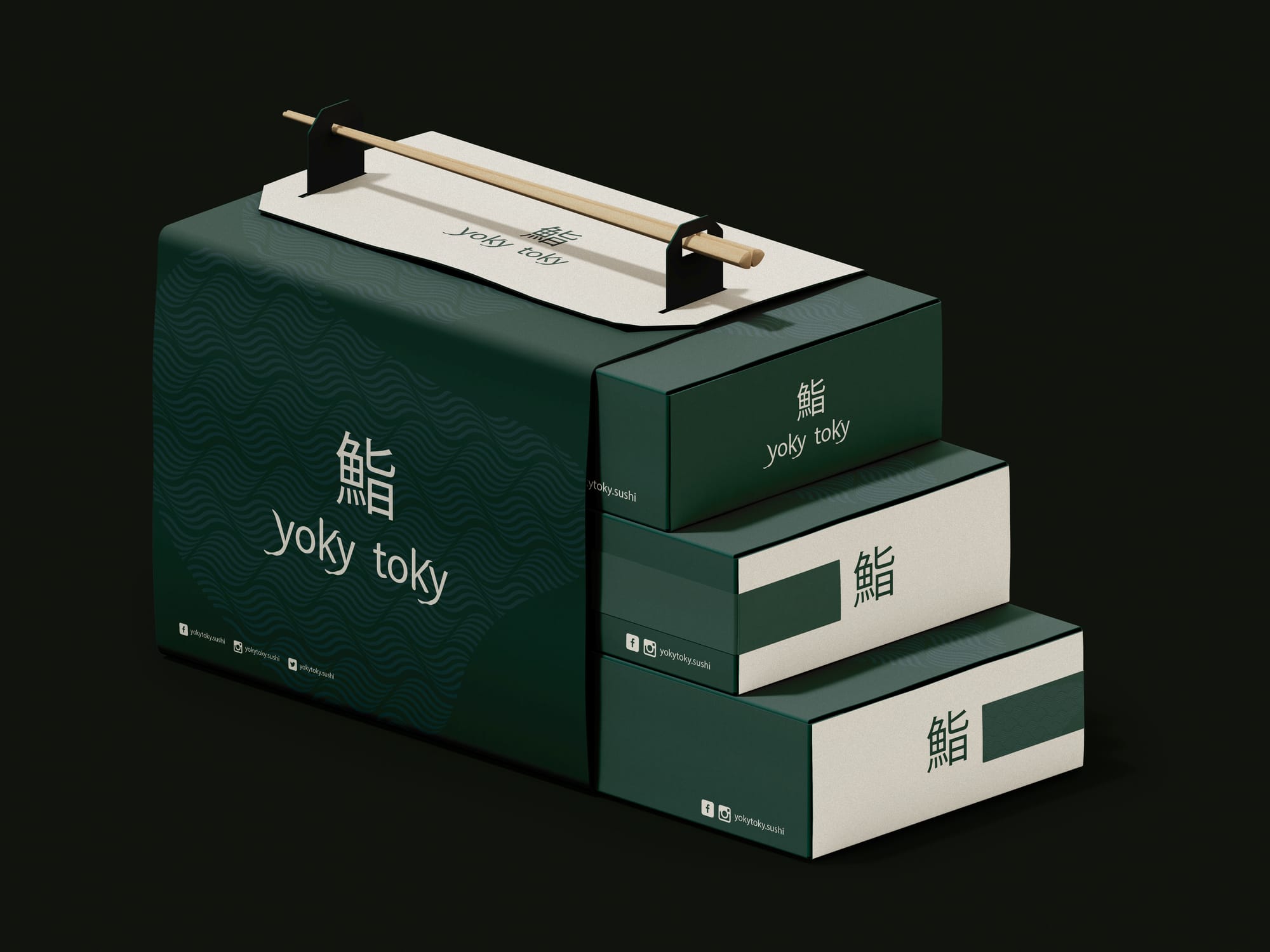
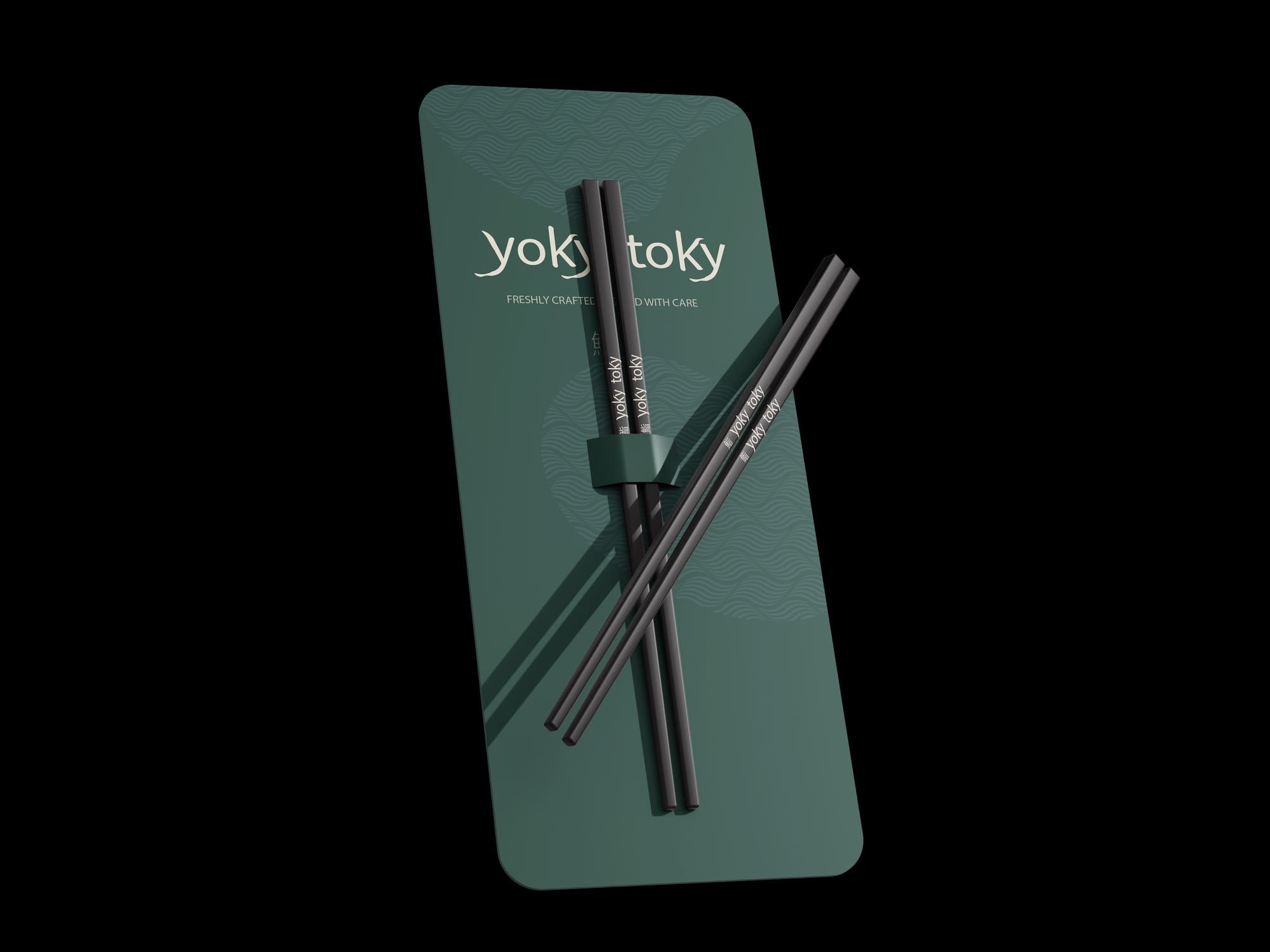
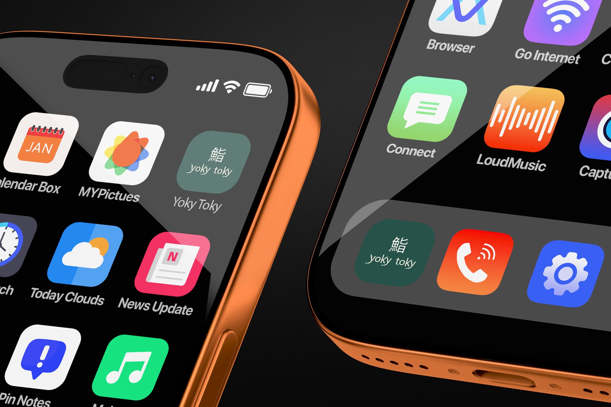
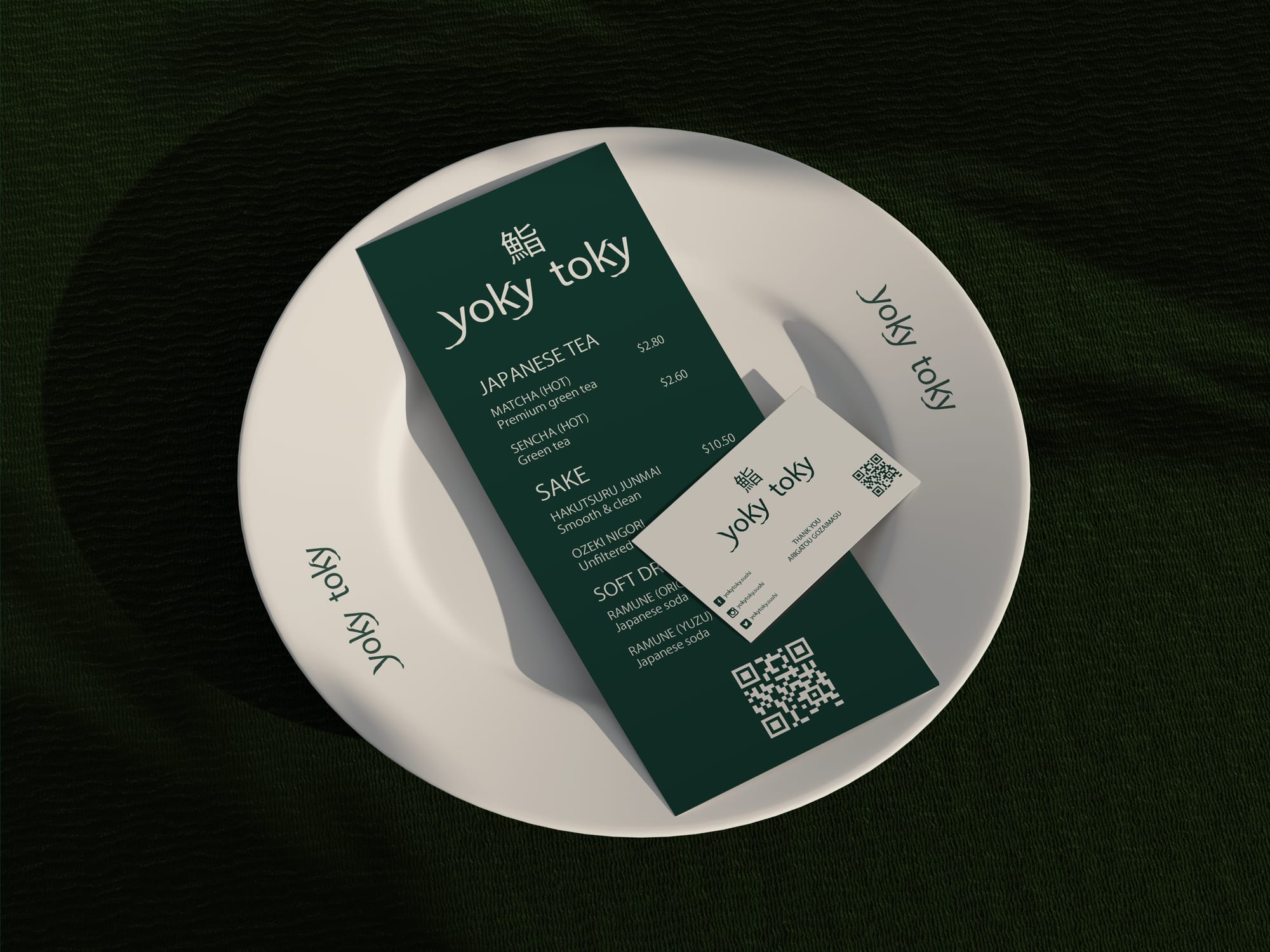
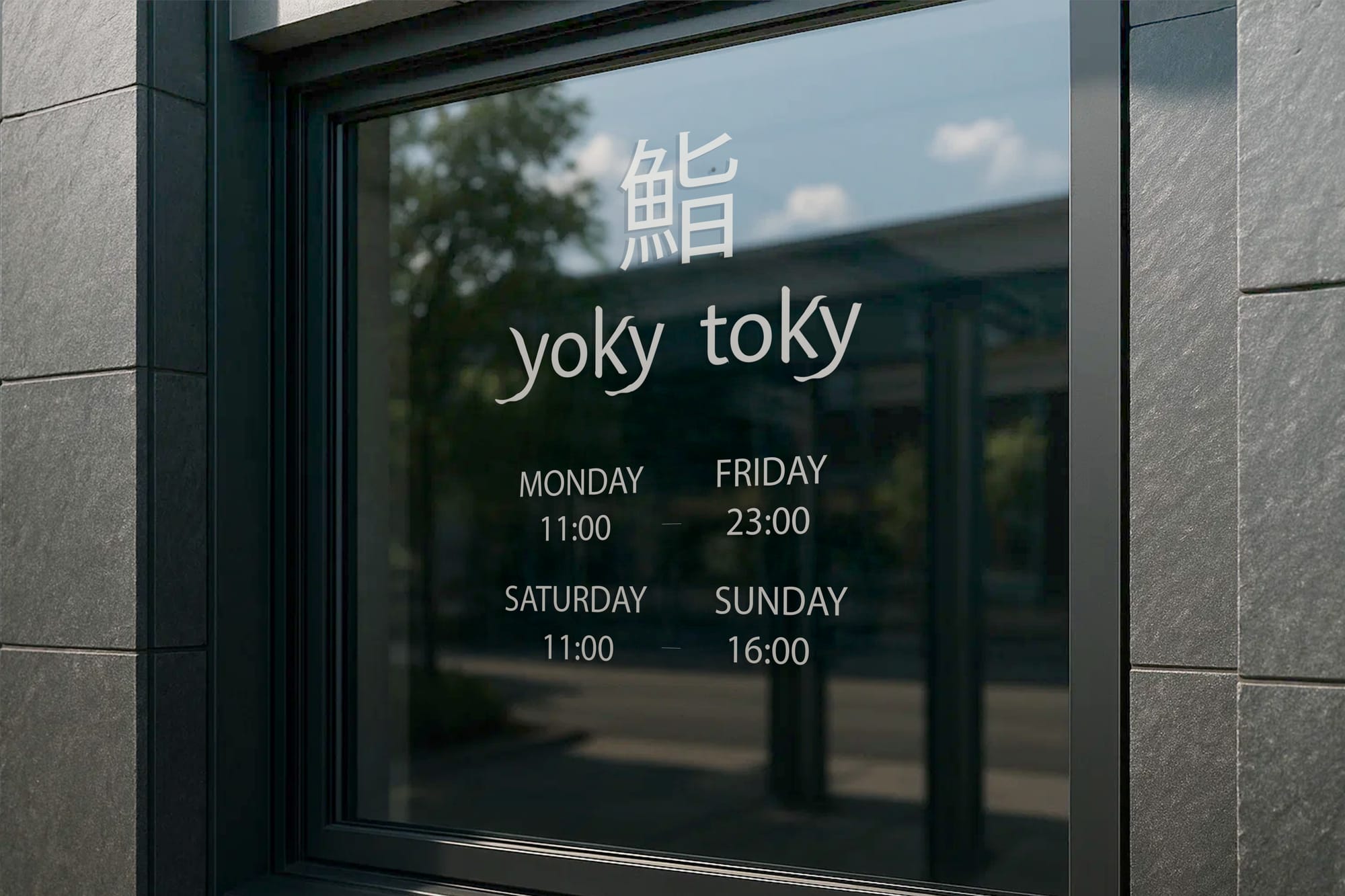
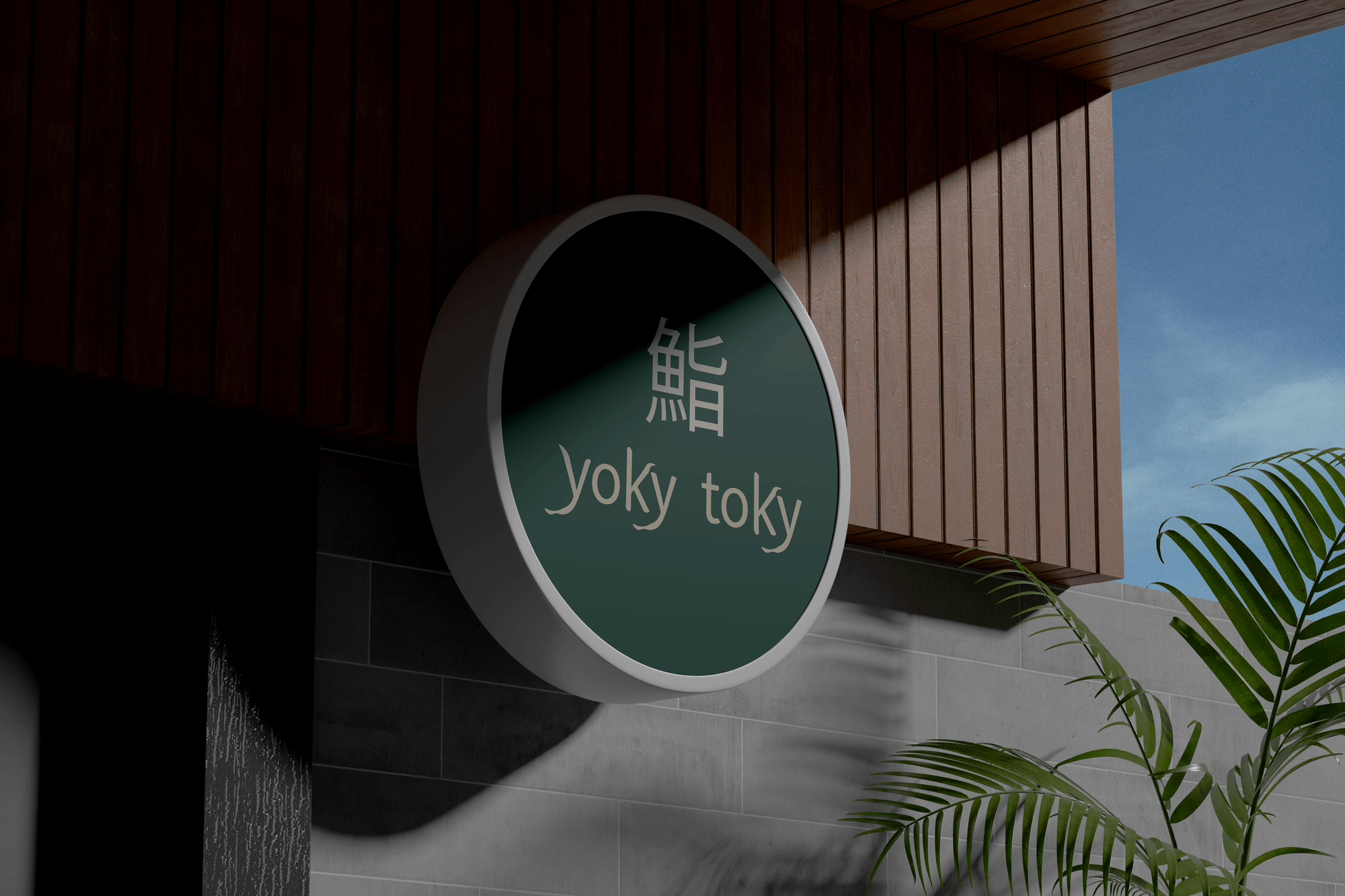
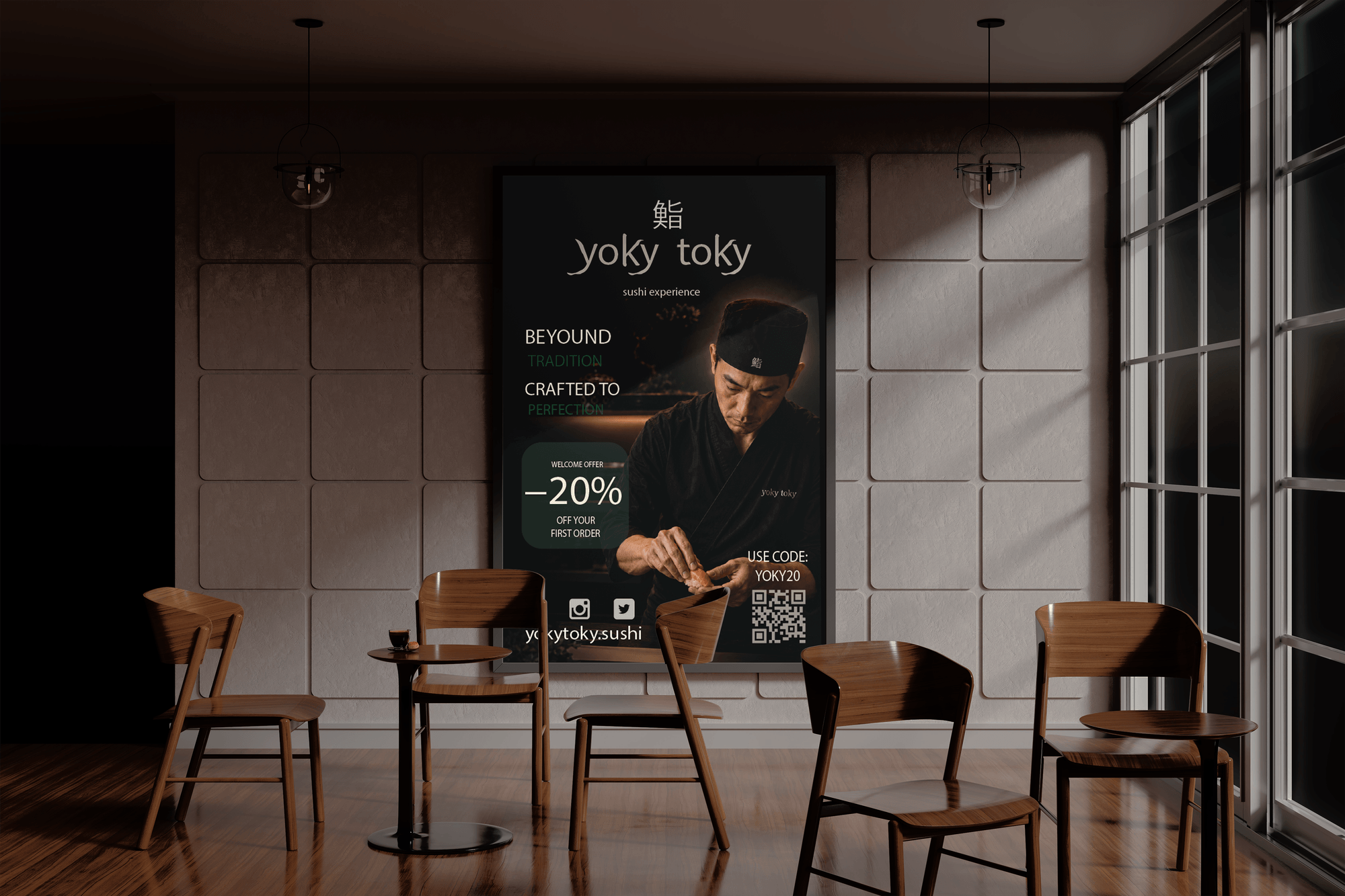
The identity is built around deep green tones, warm neutrals, and a subtle wave pattern. Together, they form a visual language rooted in Japanese aesthetics. The Japanese character is integrated into the identity and paired with the typography as an essential part of the brand, not just a decorative flourish. The visual system extends across packaging, menus, signage, digital applications, and promotional materials for a cohesive experience at every touchpoint. The result is a contemporary sushi identity that balances sophistication with warmth and accessibility.
Ready to build something
remarkable?
I take on a limited number of projects each quarter. Let's talk about your brand before the next slot fills up.
Work with me→