Rapture Tennis Club
Our Purpose
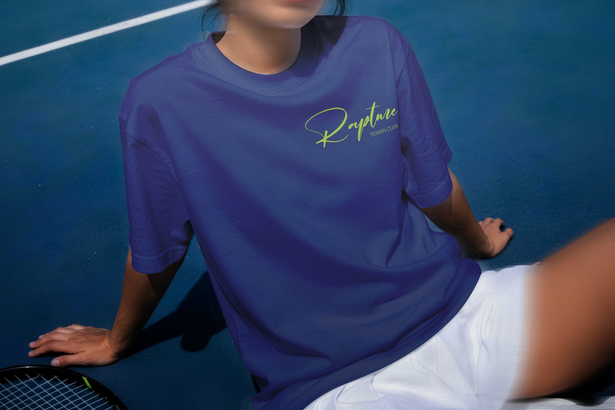
The Rapture Tennis Club identity feels energetic, confident, and modern, without losing its sense of elegance.
It moves away from tennis's usual, traditional look and speaks directly to a younger, more active audience.
The identity captures both the competitive side of the sport and the lifestyle around it, working naturally across clothing, accessories, promotional materials, and everyday club items.
Approach
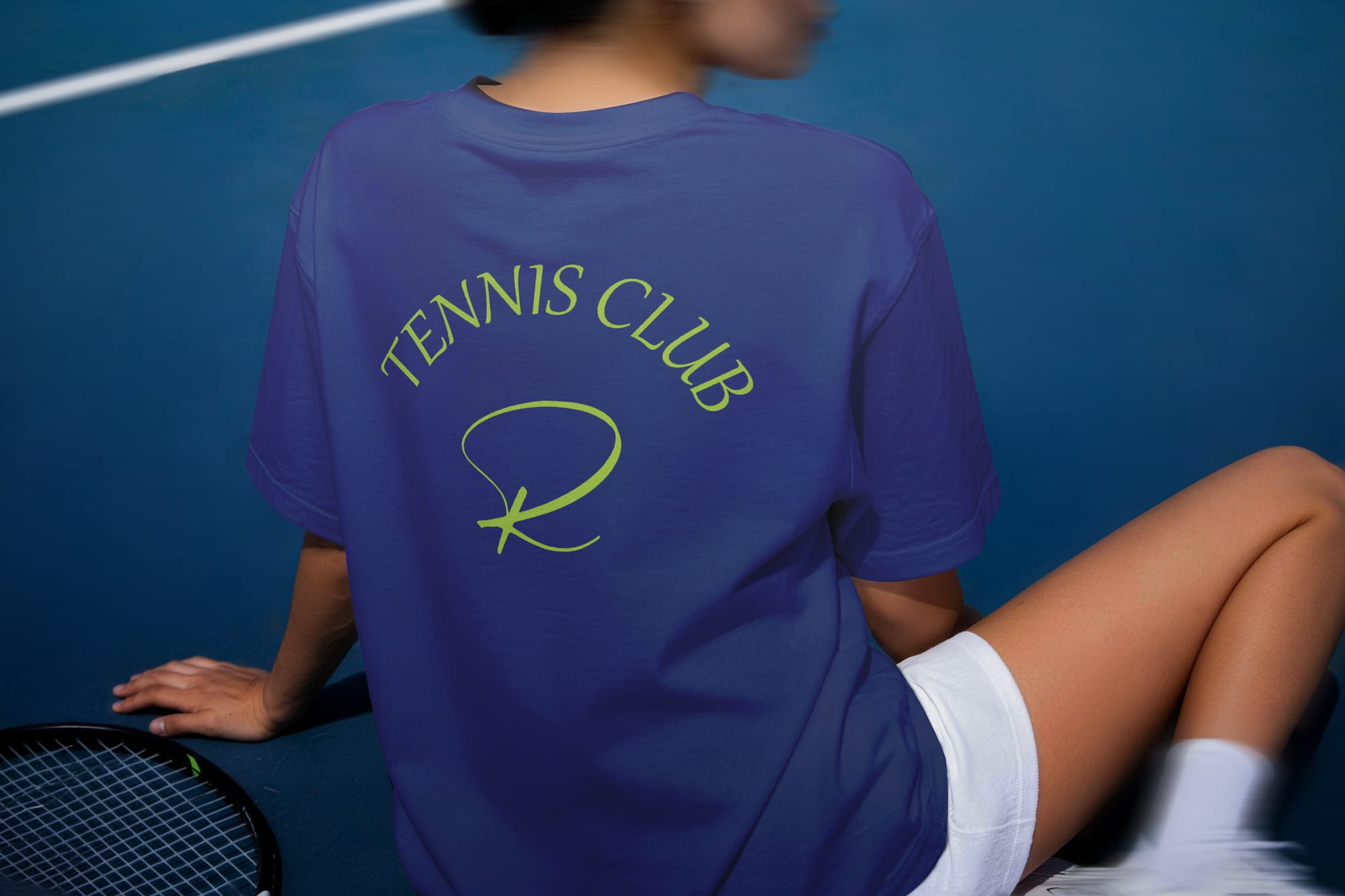
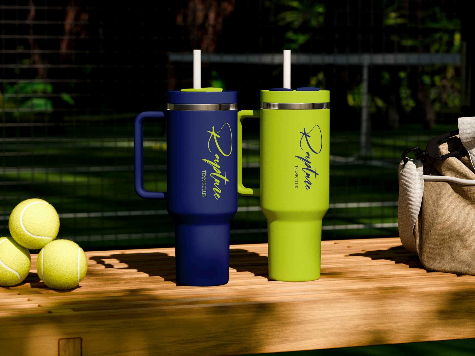
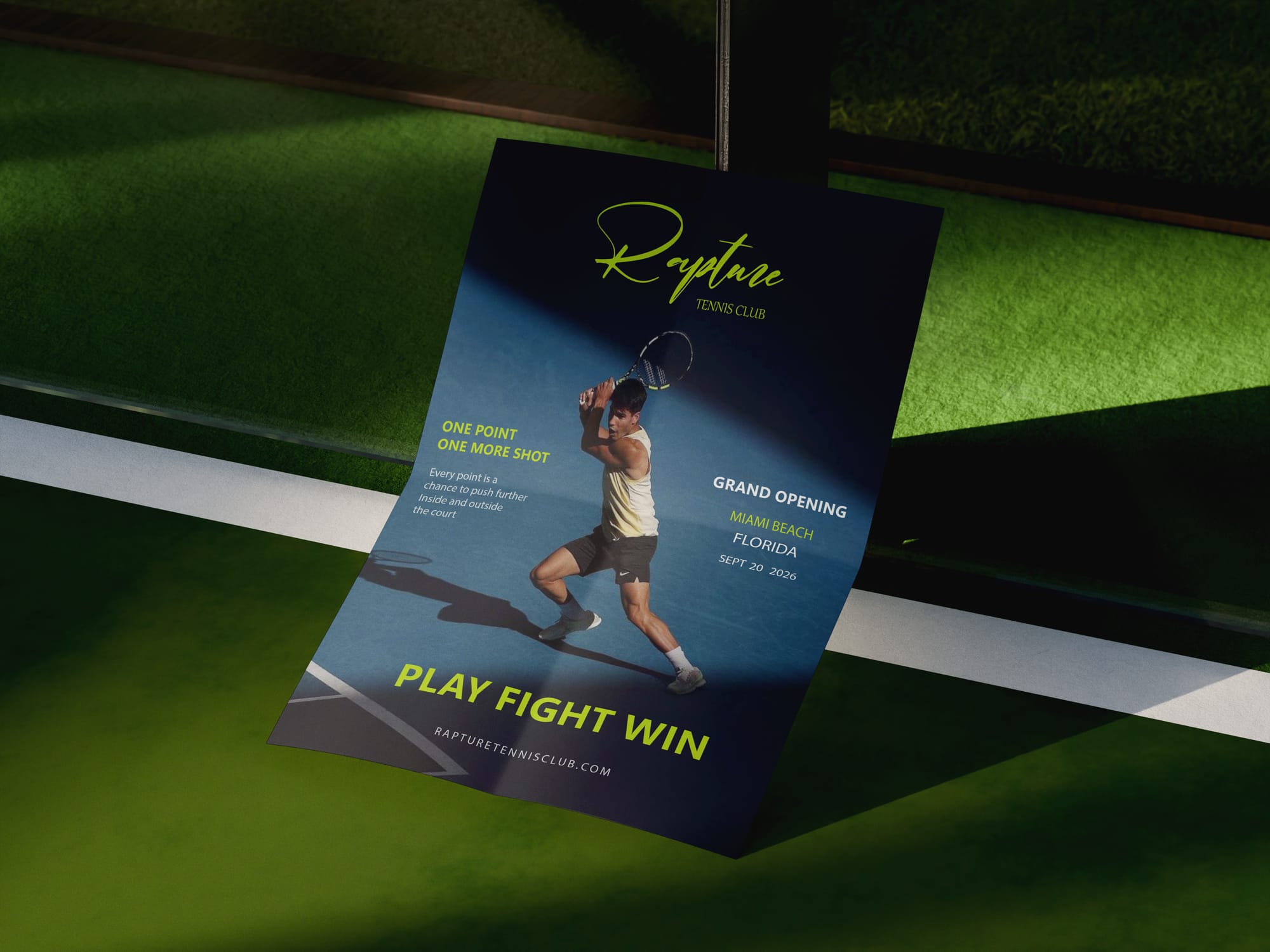
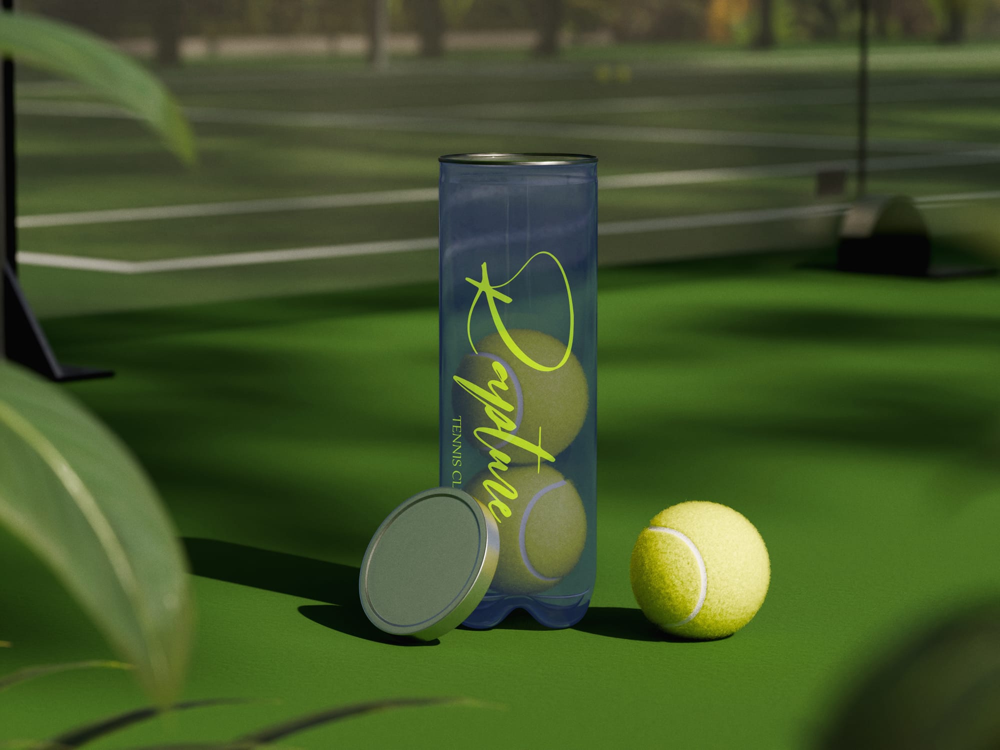
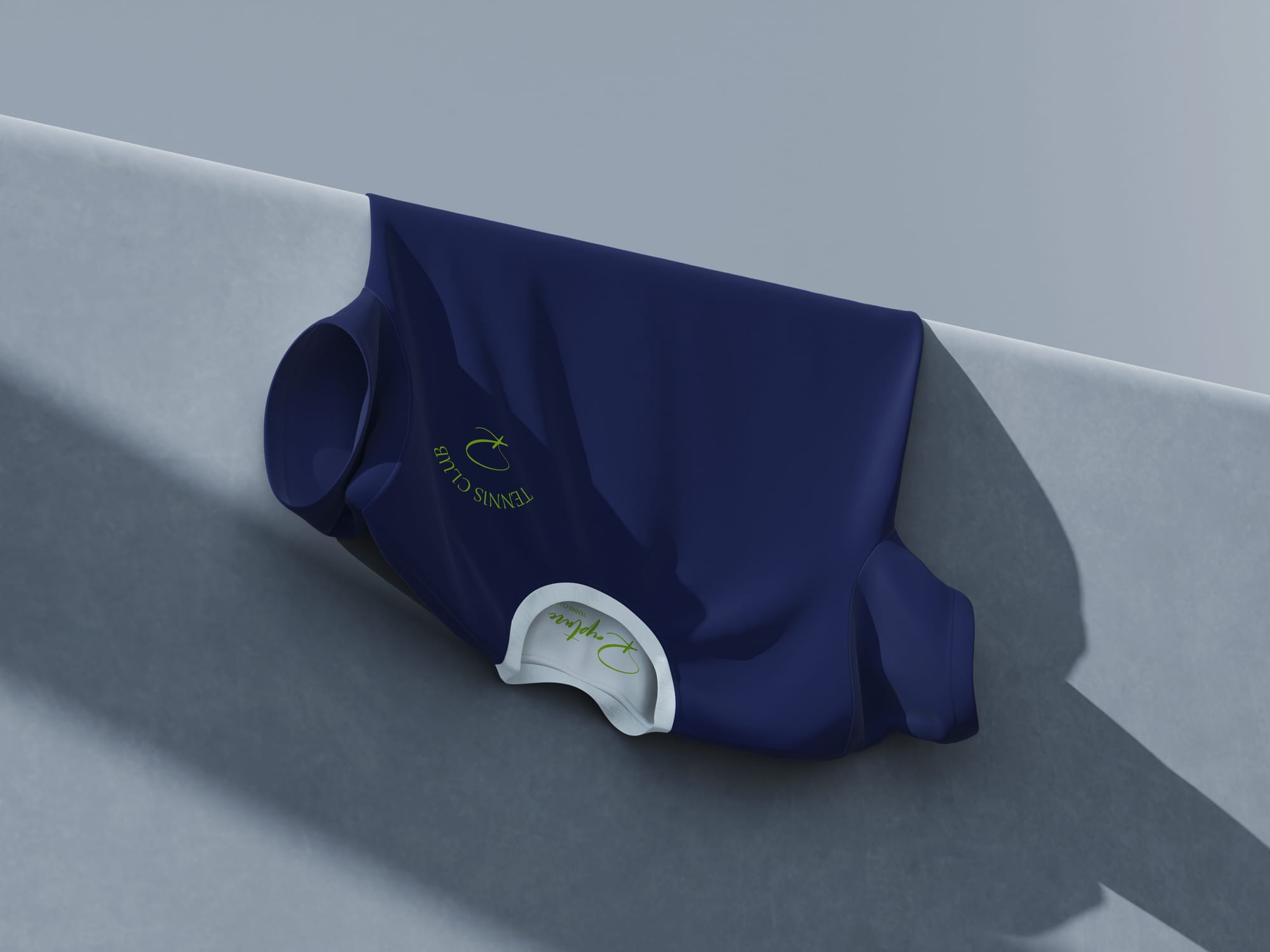
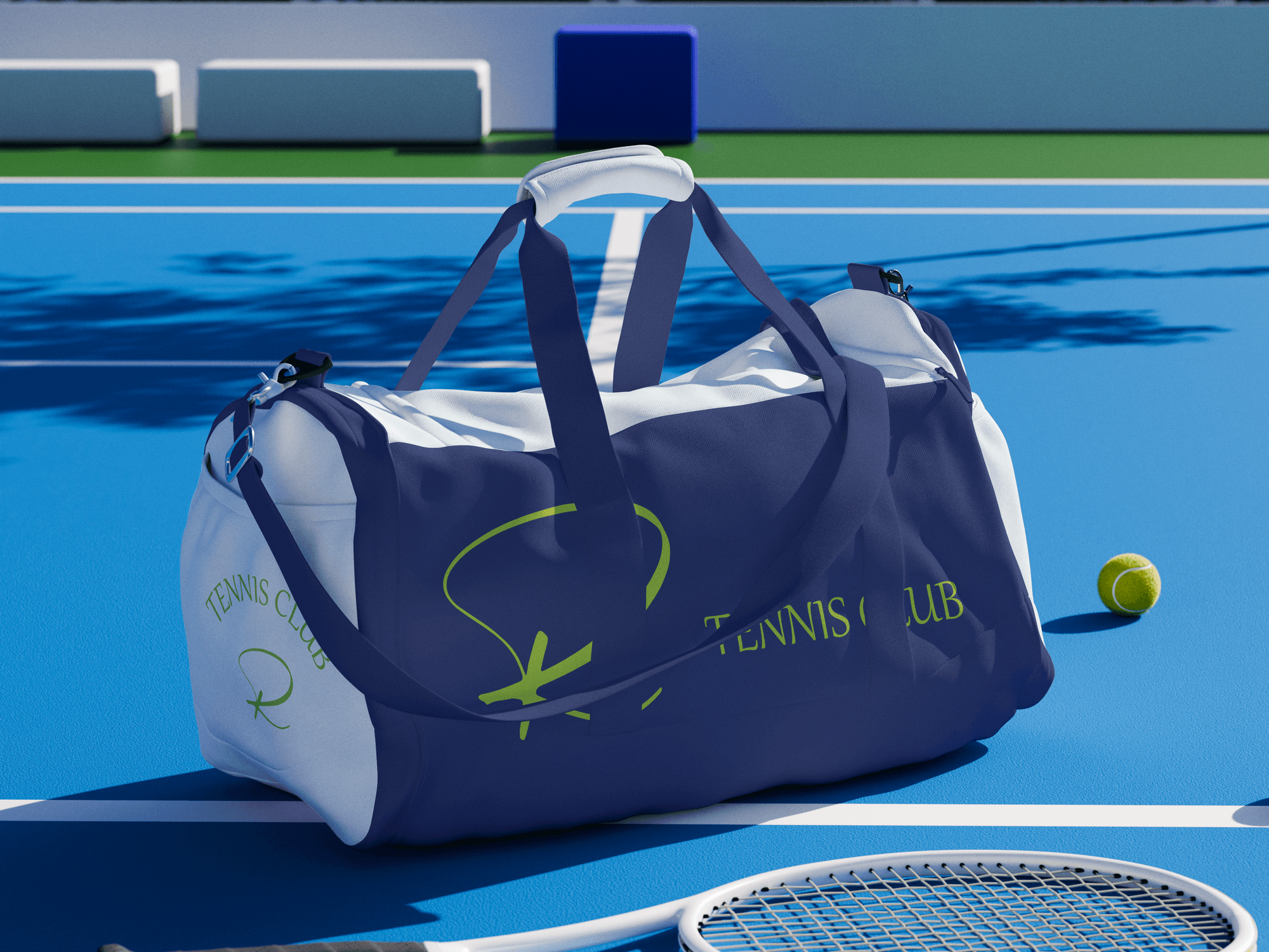
The visual identity combines deep navy, bright lime green, and white for a contrast that captures the energy of the court instantly.
The expressive, handwritten “Rapture” logo pairs with a cleaner typographic system, giving the identity a personal yet structured feel.
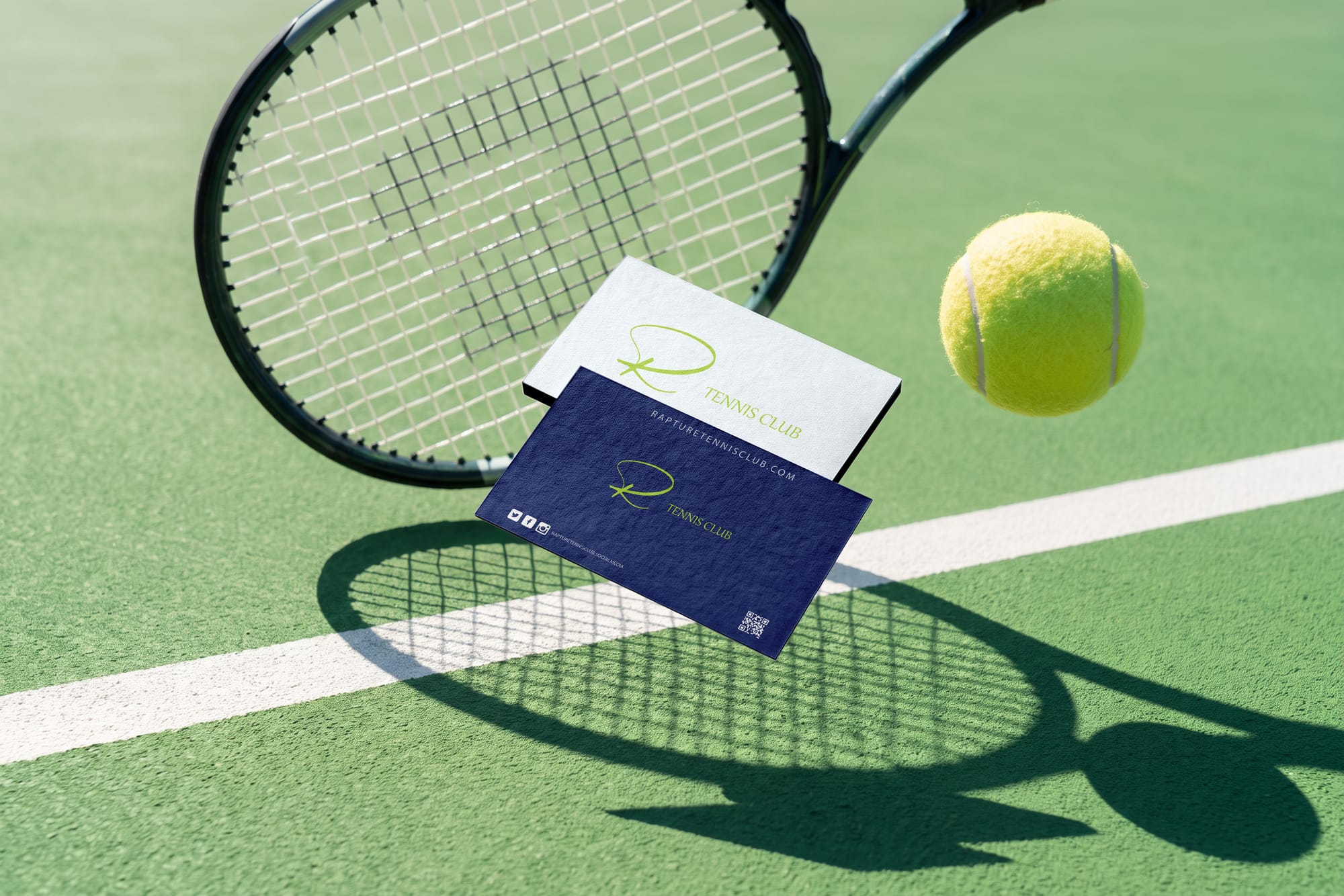
The visual language extends across t-shirts, caps, sports bags, drinkware, tennis ball packaging, business cards, and promotional materials, building a complete, recognizable world for the club.

Ready to build something
remarkable?
I take on a limited number of projects each quarter. Let's talk about your brand before the next slot fills up.
Work with me→