Kobbi
The brief
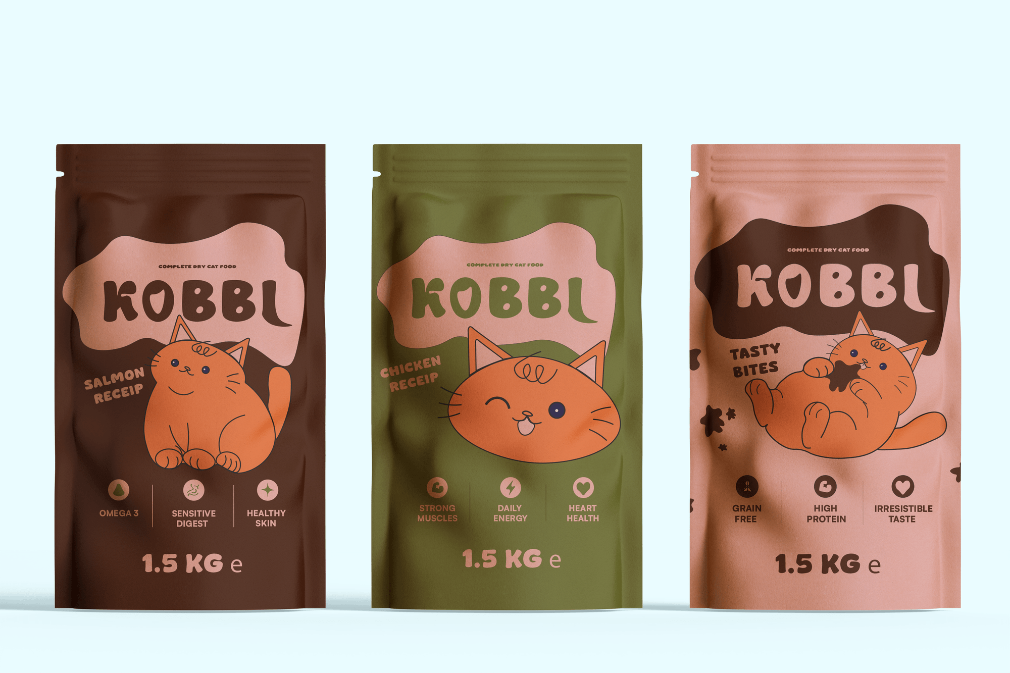
Dinner is the best part of a cat's day, and the packaging should look like it. The bag rustles, the cat sprints to the bowl with its tail up and meows at whoever is holding it. Kobbi is designed around that moment.
The cat food aisle is beige, clinical or sentimental. Paw prints, fish bones, sad-eyed kittens and fake gold repeat down the shelf, so from two meters away every bag looks the same. Kobbi uses none of them.
The tone is cheeky and the audience is cat owners in their 20s and 30s, people who treat their cat like family and buy with their eyes, in the aisle or on Instagram.
Approach
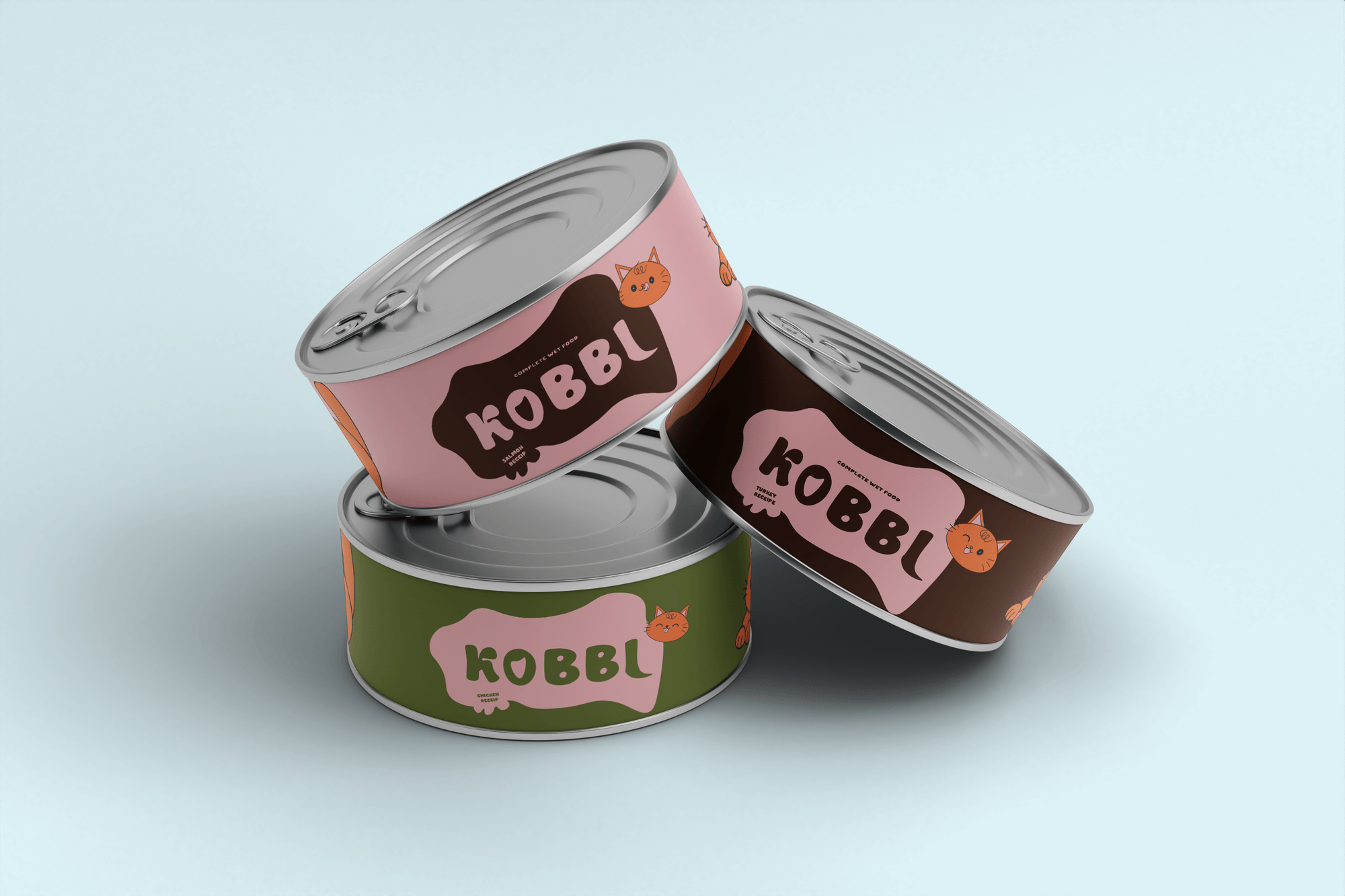
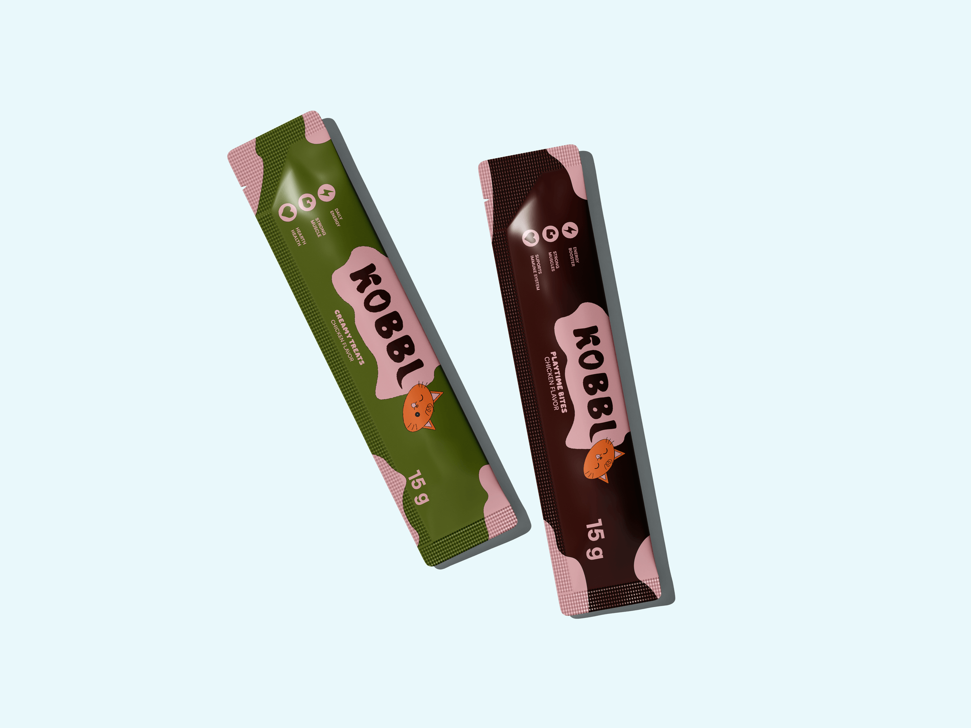
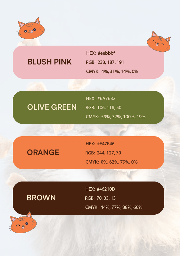
The identity uses predominantly warm colors: chocolate brown, blush pink and orange, with olive green as the cooler accent. Each flavor gets its own color, so each bag is easy to spot from across the shelf.
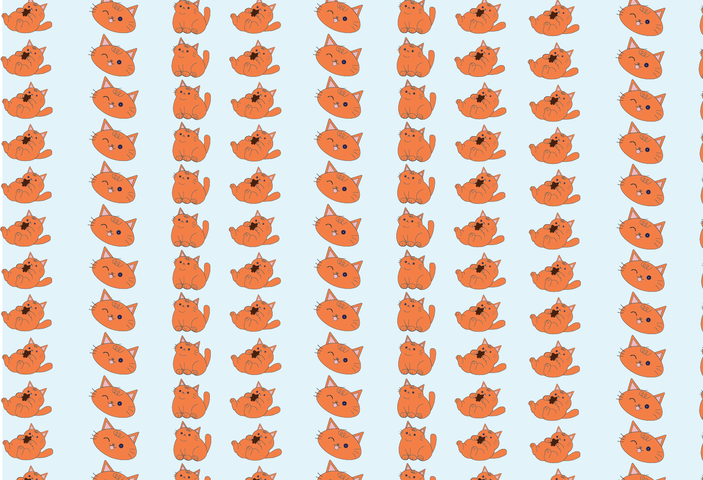
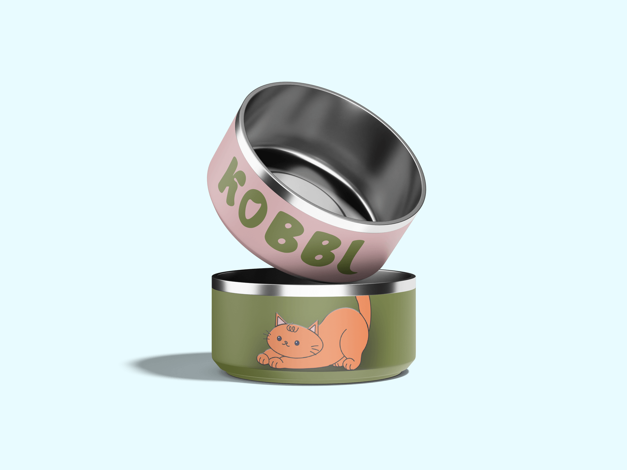
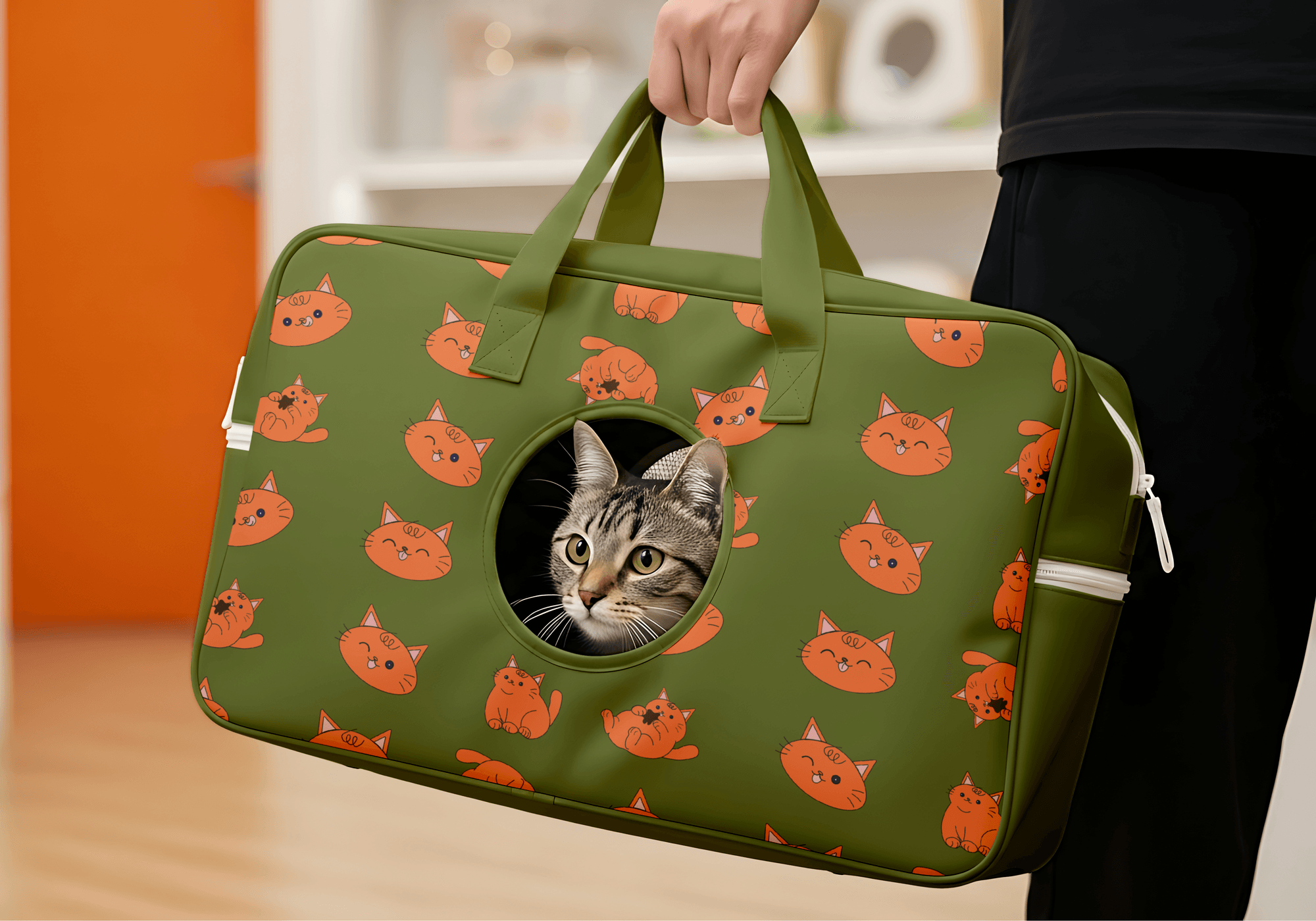
The logo is playful and rounded, with thick letters set on a soft patch of color. An orange cat character takes a different pose on every pack: sitting, winking, rolling on its back with a treat.
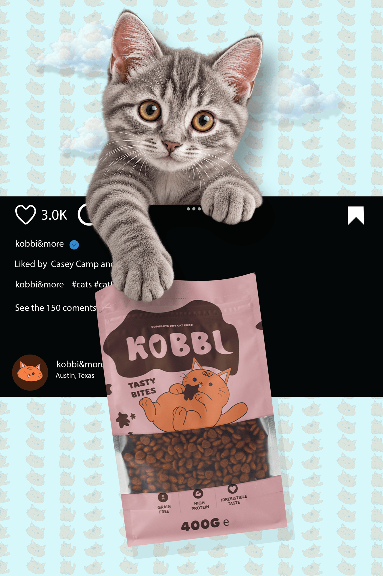
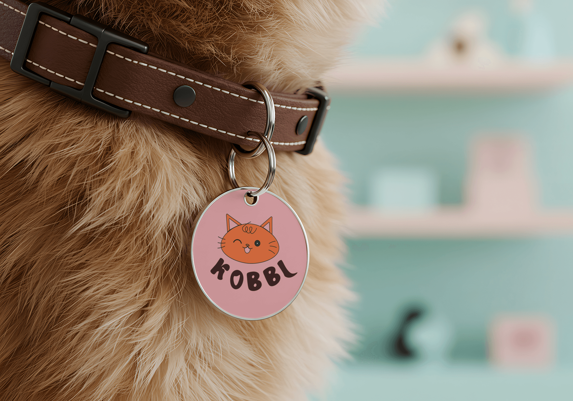
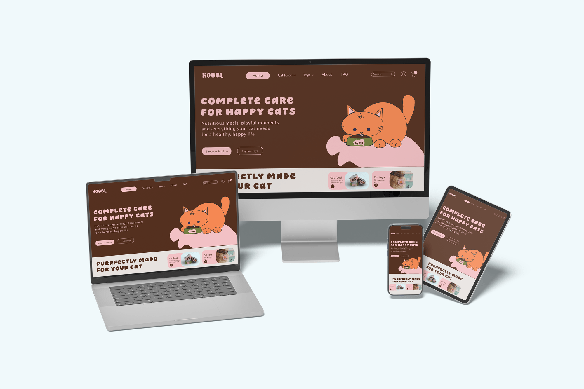
The system covers dry food pouches, cans, treat sachets, bowls, a carrier bag, a collar tag, a website and an Instagram post, each designed to look good on a kitchen counter and in a phone photo.
Opening soon
or ready for a refresh?
Tell me about your brand and what you need. I'll reply within one working day with a few questions and the next steps.
Start a Project→